Data visualization
Data visualization as well as its efficient analysis and gaining knowledge from it is a big topic given the huge amounts of data we already collect in all areas of science. Using this data to gain knowledge and make the world a better place is the most important thing we need to develop.
Data visualization in plant breeding and research on canola rapeseed
Our data visualization software is very easy to use. We have placed great emphasis on ensuring that it is as easy as possible to get started.
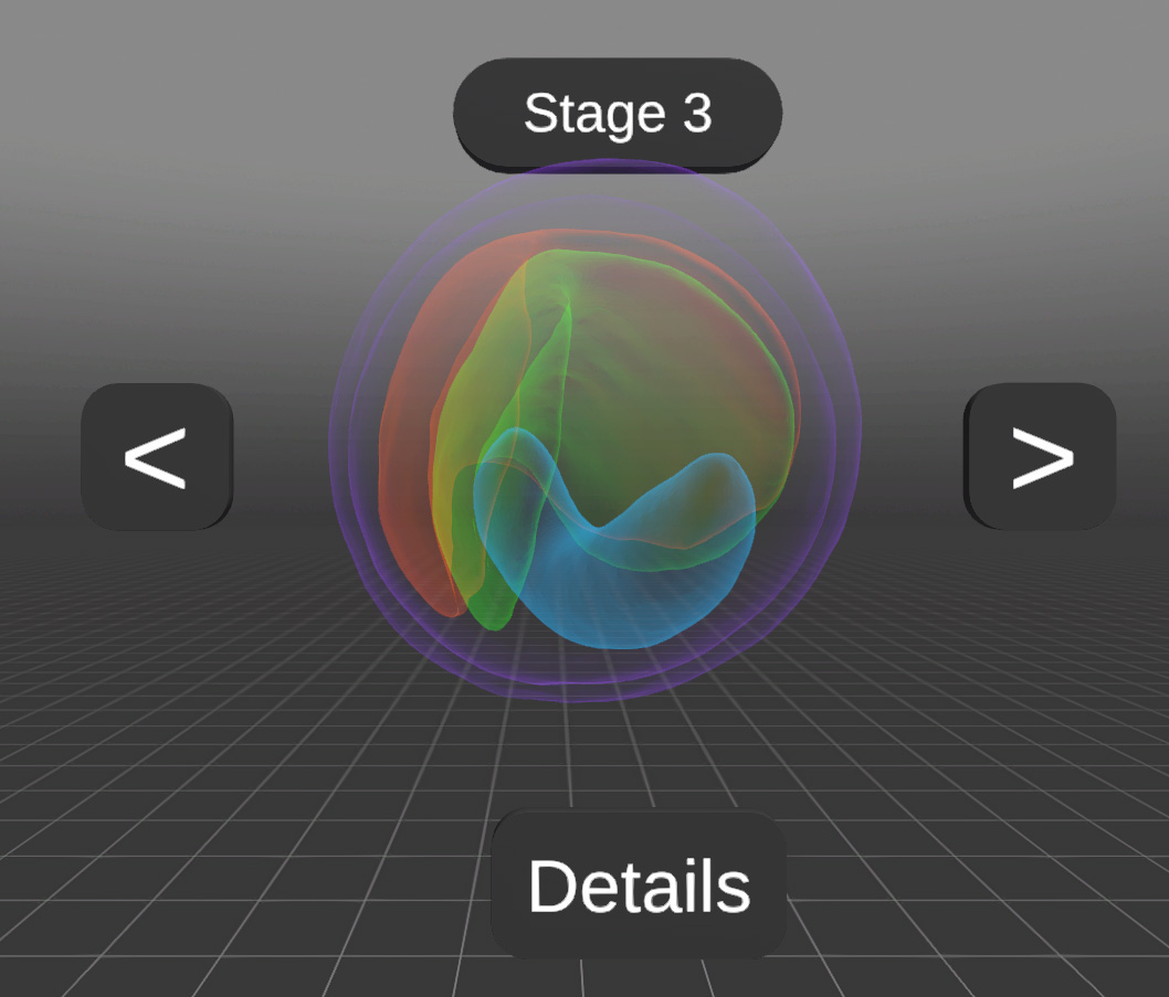
Example: 3D Seed models
3D average seedmodels from different lines to compare them and find differences in the development stages. Organs can be colored differently and also highlighted.
A rapeseed is only 1-2 mm in size!
Visualize Values over Seed Organs
Individual organs of a seed can be examined more closely and compared in terms of variability relative to an average seed.
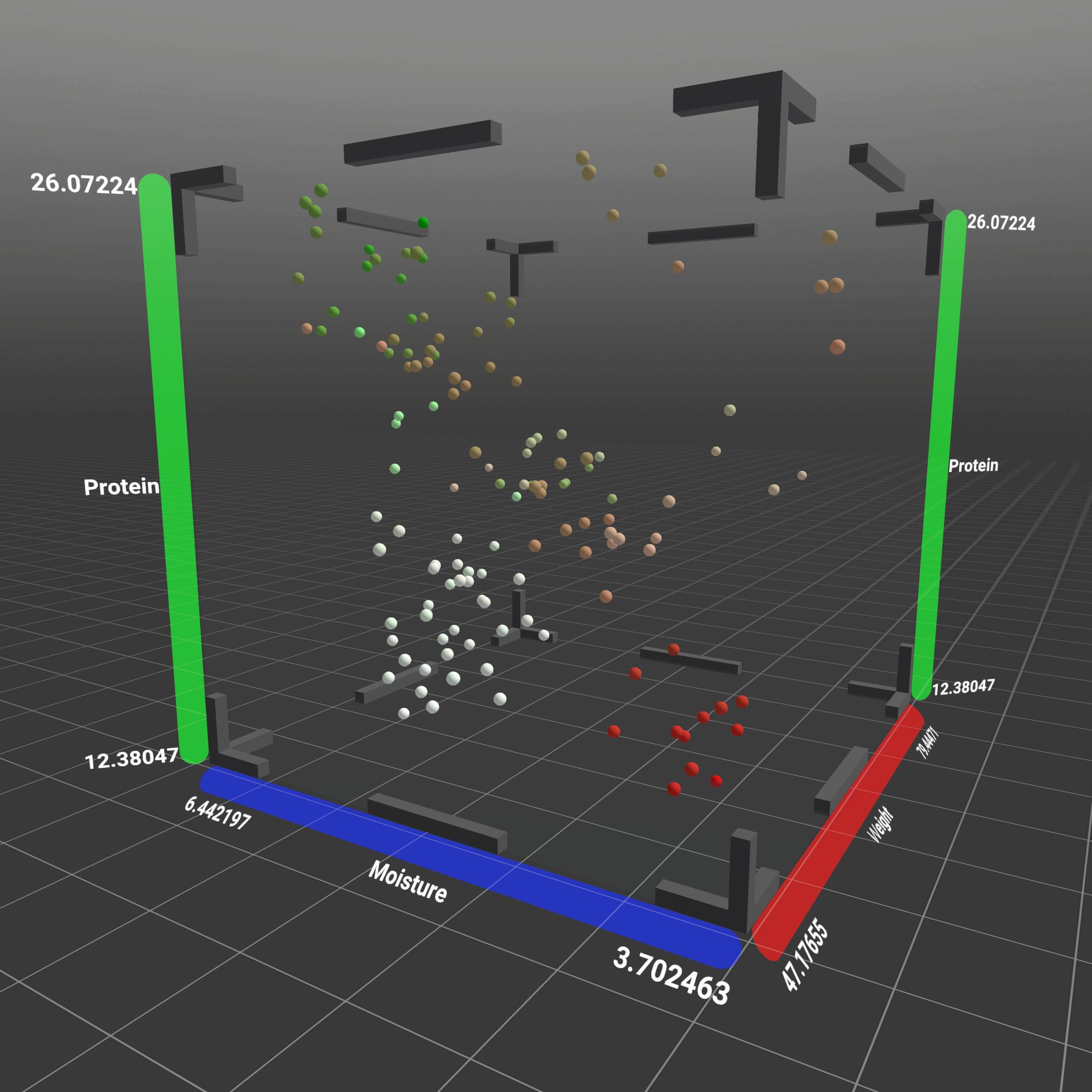
Scatterplots
Offers a 3D visualization by combining different seed data types on the axes, integrating the scatterplot view from PCA datasets for TD NMR measurements.
On the one hand, the locations of the harvest can be represented by colors, the years are coded by symbols and on the axes we see the weight, protein content and moisture. You can fly into the scatterplot or zoom in and analyze the data points with each other.
The principal component analysis (PCA) for the analyzed samples, depicts the relative vector position based on transcript abundance for genes. The application can visualize this in a simple 2D graph or in a scatterplot.
Both of these use different colors and symbols that can represent different information about the given datapoint. The axes represent (and can be changed by the user) one of the principle components listed by the given data.
Seed Grid – Direct Seed Comparision
3D models can be analyzed regarding size and seed organs (seed coat, radicula Inner and outer cotyledon). The organs are displayed transparently, allowing the user to clearly observe how they change over time and across genetic lineages.
The model, combined with animation, can clearly illustrate the variance within the collected data. The seed models also function as visual representation in other areas of the application.
Graphes
Differentially Expressed Genes (DEGs) are defined as genes that have a significantly different mRNA abundance when comparing two conditions, stages or genotypes or tissues.
The data is represented in a volcano plot graph, with adjustable threshold values. The data can be accessed through selecting two seed models from the seed grid, allowing the user to have a context for the origins of the data.